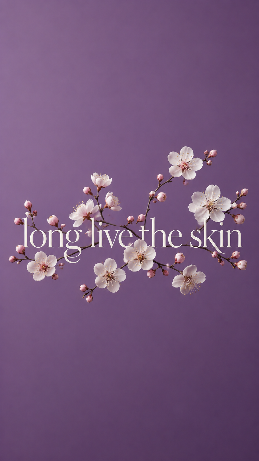
In conversation with Thomas Berloffa, Creative Director
Designing a brand like The Nine Aurora is not about creating a logo or packaging—it is about building a system of meaning. We spoke with creative director Thomas Berloffa about the thinking behind the identity, from the symbolic construction of the logo to the idea of “unpackaging” and the evolution of a more functional digital experience.
The Logo: From the Circle of Life to the Break of Innovation
The logo evolves from a circle into a nine. What does that gesture represent?
The starting point was the circle—not as a graphic choice, but as a universal symbol. The circle represents the cycle of life, the rhythm of the moon, and the idea of continuity. It also reflects a woman’s journey through different phases—growth, maturity, transformation, renewal.
But what interested me was not the cycle itself—it was the moment you decide to move beyond it.
So the circle is intentionally broken. From that break, the nine emerges.
The nine carries multiple meanings. It represents the nine beauty zones, but also something more intimate—the idea of creation. Nine months of life forming, a body evolving, something growing over time.
At the same time, the form starts to open, almost like a bloom. Not a literal flower, but a suggestion of expansion—something organic emerging from structure.
That transition—from circle to nine, from closed to open—is where the identity lives.
The circle represents life.
The nine represents evolution.
And the break between them represents innovation—the moment where the brand chooses not to follow the cycle, but to redefine it.![]()
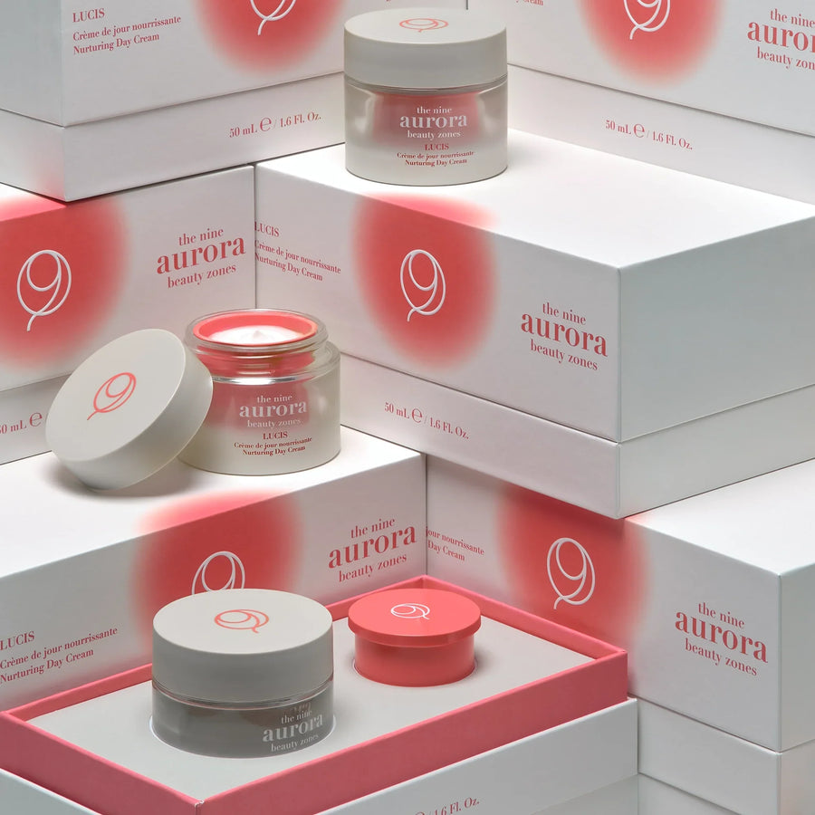
The Colors: Between Skin, Depth, and Light
The palette feels minimal but very intentional. How did you define it?
We approached color as an emotional system, not as decoration.
There are three core tones that define the identity. A coral tone that feels very close to skin—alive, warm, human. Then a violet tone that introduces depth and introspection, something more intellectual and calm. And finally an ivory tone, which creates space and light.
These three elements create a balance. You have something very physical, something very mental, and something very pure.
What was important was restraint. We didn’t want a loud palette. We wanted something that feels controlled, almost editorial—closer to the language of design magazines than traditional beauty brands.
Color here is not trying to attract attention. It’s trying to create atmosphere.

Packaging: From Packaging to Unpackaging
The packaging feels unconventional—almost like “unpackaging.” What was the idea behind it?
Exactly. The idea was not to design packaging in the traditional sense, but to reduce it.
We wanted to remove everything that is unnecessary and focus on what remains. The object becomes something you keep, not something you throw away.
At the same time, there is a functional layer—the refill. But we didn’t want the refill to feel technical or complicated. It had to feel natural, almost like part of the ritual.
So the design is minimal, but it’s also guiding behavior. It shows you that this is something you return to, something you reuse.
In that sense, it’s less about sustainability as a statement, and more about sustainability as a habit.
Luxury today is not about excess. It’s about precision and longevity.

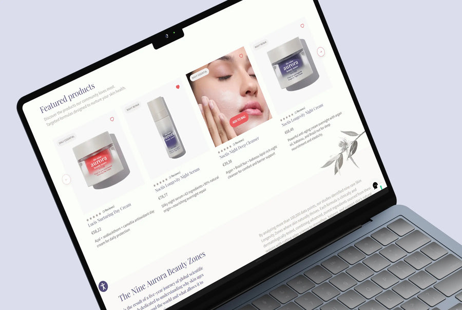
The Visual Website Identity: Designing Depth Without Noise
The website feels more like a system than a traditional e-commerce experience. How did you approach it?
The challenge was to create depth without complexity.
There is a lot of information—ingredients, routines, philosophy, personalization—but the user should never feel overwhelmed. So we designed it in layers.
The first layer is very calm—typography, spacing, imagery. Then, as you go deeper, you access more information, more detail, more functionality.
It’s about controlling how information appears over time.
We didn’t want a website that just sells products. We wanted a space that explains, that guides, that supports a long-term relationship.
From a design perspective, that means clarity is everything. If the system is clear, you can add depth without creating noise.

A System, Not Just a Brand
For Thomas Berloffa, The Nine Aurora is not defined by a single element, but by the coherence between all of them.
“It’s not about designing a logo, or a package, or a website,” he explains.
“It’s about designing how all these elements speak to each other.”
From the circle that becomes a nine, to a palette that balances warmth and restraint, to objects that are kept rather than discarded, and a digital experience that unfolds over time—the identity is built as a system.
One that reflects the same idea at every level:
beauty is not immediate—it is something that evolves.